CSS Animations: Create Bouncing Ball Animation From Scratch

Bula! 🌺 I'm a self-taught Software Developer from Fiji. I love to code, learn, write & help people through my technical articles.
One of the things that I had always wanted to do with projects' I've worked on during my ongoing journey as an aspiring software developer was to make my website's UI a lot more appealing & less boring to look at.
This isn't to say that the color schemes & design specifications I had to abide by weren't perfect for this. Instead, it is to make it…well….more appealing. Or at least to be quite frank…not static.
It created a nagging thought in mind every time I worked on a project. Browsing through the beautiful designs on Dribbble for an hour every day didn't help either (or so I thought). Eventually, I came across one of the coolest CSS properties I believed solved this for me (all thanks to one of my previous projects!): the CSS Animation.
This article will be a step-by-step tutorial guide on using the CSS Animation property to create an animation. The animation will be of a ball bouncing infinitely in a confined space when dropped from above. Before we 'bounce' into it, you may need to have at least a beginner to advanced beginner level of understanding of HTML5 and CSS3. Like I've said, I found this CSS property to be useful for some of my project's UI & you'd probably find it useful too! Let's get right into it!
(NOTE: You will need a text editor for this whether it's Visual Studio Code or Atom etc.)
Step 1: Create your folder with the following files & folder in it.
Open your text editor and create your folder as seen below:
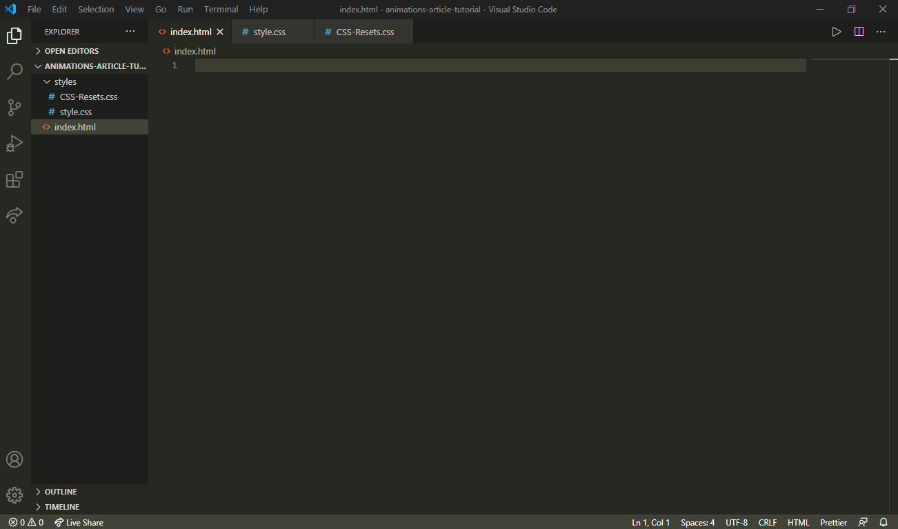
Fig. 1.0 Create the folder for this tutorial.
I've created a folder called 'animations-article-tutorial'. Within it, I have created:
- an index.html file
- a styles folder that has: a) a CSS-Resets.css file b) a style.css file
Step 2: Paste & save the CSS Resets code from Eric Meyer's CSS Resets file into the CSS-Resets.css file.
This is to reset/remove any default CSS stylings of any web browser you'd use to view your work.
If you need to read more about this, visit Eric Meyer's website where he explains more about this.
Step 3: Copy & paste the code below into your index.html file and your style.css file
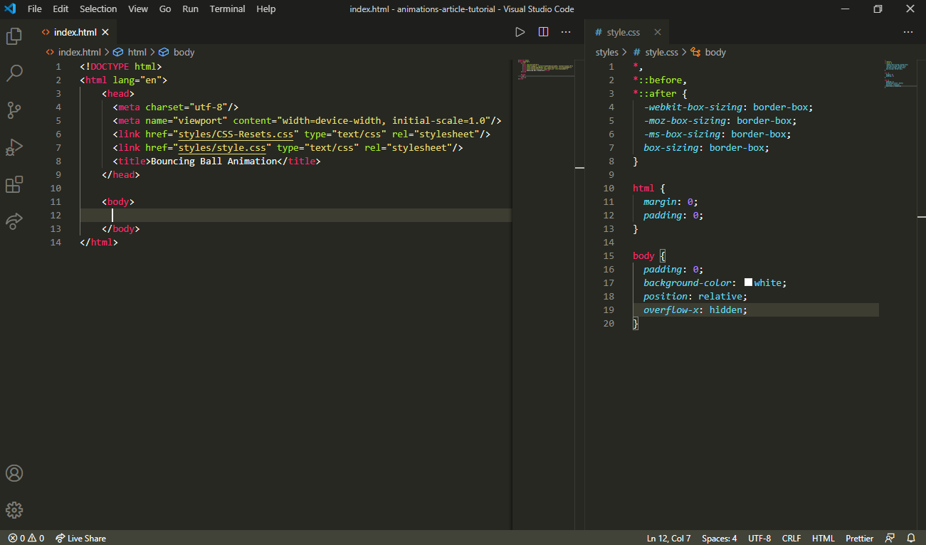
Fig. 1.1 Create the files for the web page.
Step 4: Create a ball.
Now, we can't bounce a ball if it doesn't even exist! Let's create one using the HTML & CSS code below.
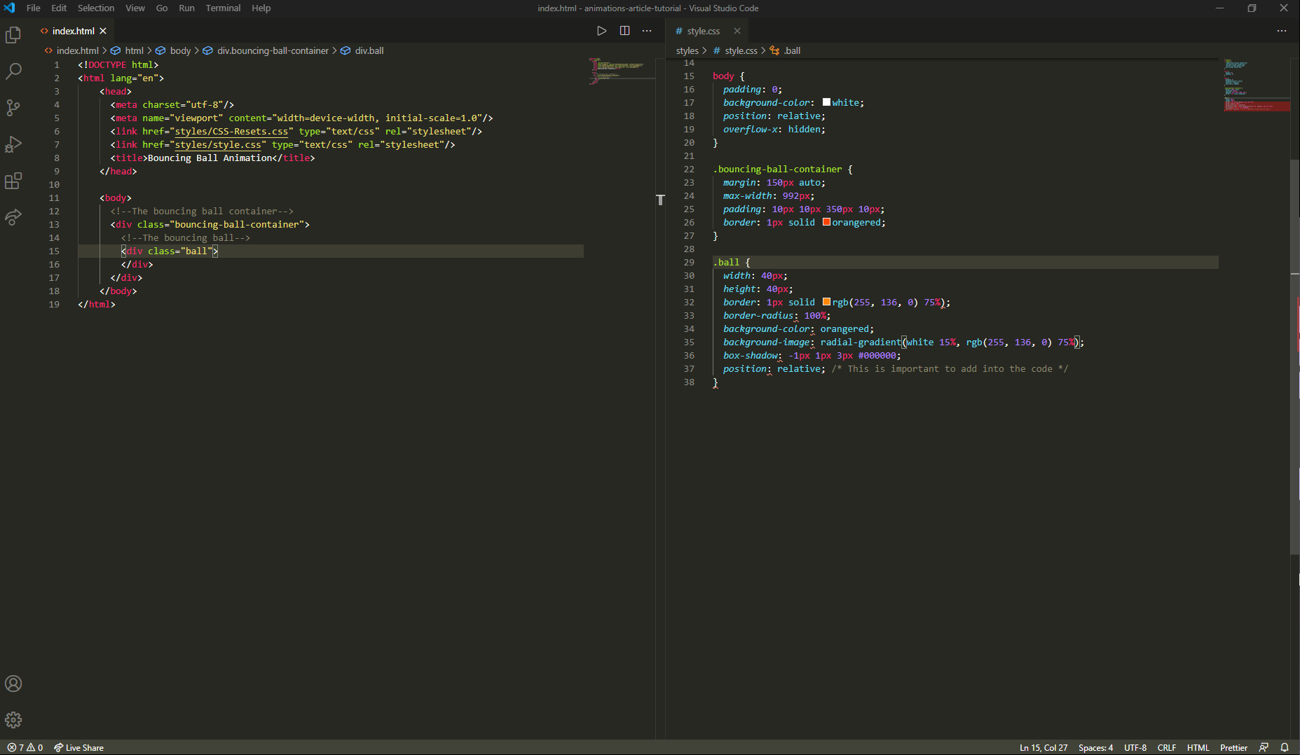
Fig. 1.2 Creating the container in which the ball is going to be bouncing in & the ball itself.
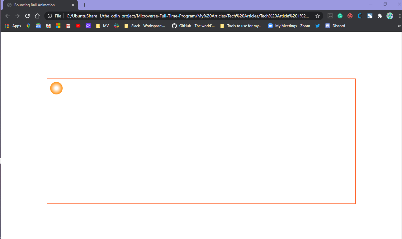
Fig. 1.3 The bouncing-ball-container & the ball contained in it.
Step 5: Name your animation & store it as a value for the animation-name property
This is where the real fun begins - the nitty-gritty!
An animation would need a name whether the animation is a rotating square when hovering your cursor over it or a constantly color-changing (chameleon) rectangle. This name will then be the value of the animation-name property in the CSS code.
In our case, our animation is a bouncing ball. To keep animation names clear & concise, I've made up the 3 rules below for good naming conventions:
- name the animation to be exactly what it is doing &/or what it is being applied to (for simplicity's sake)
- keep the alphabet letters to lower case
- hyphenate each word in the animation-name
To put all this together, I've come up with this animation name for our animation: bouncing-ball. This is the value for the animation-name property.
Back to your text editor, you will place the property and its value as such in your style.css stylesheet:
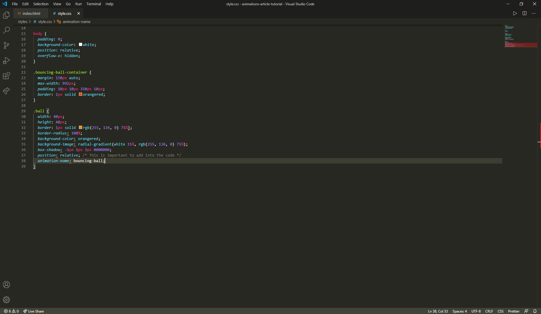
Fig. 1.4 Creating the animations' name and placing it as a value for the animation-name property
Step 6: Create an animation!
From Step 5, we've named our animation to bouncing-ball. We'll also need this value to create the animation.
To create the animation, we'll be using the @keyframes animation-name {} rule. In place of the animation-name in the @keyframes rule, put your animation-name property's value there:
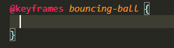
Fig. 1.5 The keyframes rule
There are two ways in which you can create the animation code:
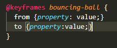
Fig. 1.6 The first way to create the animation code
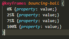
Fig. 1.7 The second way to create the animation code
For the first keyframe seen in Fig. 1.6, we are creating some animation code from:
a. the initial state (0%) using the 'from' rule and; b. then the final state (100%) using the 'to' rule.
The second keyframe in Fig. 1.7, we are creating an animation code from its:
a. initial state (0%); b. to 25%; c. to 75% and; d. its final state (100%).
Keep in mind that the percentage values of the different states can change to fit into the animation you are trying to create. You can even add more percentage values for different states.
Within the curly braces of the rules at different states, this is where you'd specify the CSS properties of the element you're targeting and the different values you'd want it to change to.
We will be using the second keyframe to create our bouncing ball animation. Place the code below for the animation within the curly braces of the @keyframes rule:
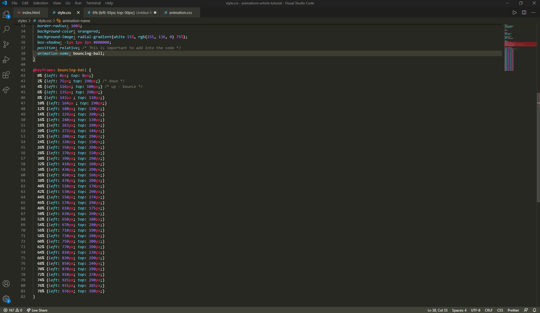
Fig. 1.8 The animation code for the bouncing ball animation
For a brief explanation of the animation code in Fig. 1.8, our animation begins from the initial state (0%) with our helper properties (top property & left property for our animation) both at values where the ball is at the top-left corner of the container.
Since we are dropping the ball from a height & the ball has to bounce from left to right, the left property has an absolute-length value of 0px, and the top property has an absolute-length value of 0px for the container we have created.
The value of the top & left properties are the only things we would change for each state to make it bounce from left to right.
At 2%, we would expect the ball to be hitting the bottom of the container & moving to the right. The left property will then have a value of 75px, and the top property has a value of 290px. Then, at 4% we would expect the ball to bounce & still move further to the right. Hence, the left value is 116px and top value is 100px. From here, it keeps alternating between values from when it hits the bottom of the container & when it bounces back up into the air (and of course, the left value keeps increasing since it's moving to the right). These values and the states' percentage values can definitely change for however you like it to be for your animation.
Step 7: Make the animation work!
Still here? Phew! Ok, great! And awesome job so far!
Now, we've created the animation and have named it to what the animation is about. But, it's not working for some reason?!
That's because we aren't done yet! We need to set a few more properties to get it to work. To get the ball bouncing.
This brings us to the following animation properties listed below and the different accepted values for each property:
- animation-duration: time in seconds;
- animation-iteration-count: positive integer value | infinite;
- animation-direction: normal | reverse | alternate | alternate-reverse;
- animation-timing-function: ease | ease-in | ease-out | ease-in-out | linear | cubic-bezier(a,b,c,d);
- animation-fill-mode: none | forwards | backwards | both ;
- animation-delay: positive value for time in seconds | negative value for time in seconds ;
We want the ball to:
- bounce & keep bouncing for a longer time till it stops bouncing for e.g for 15 seconds.
- bounce infinitely.
- bounce in only one direction (from left to right)
- have an almost natural bounce from beginning to end.
- have no other CSS styles for the ball at the initial state & final state.
- start bouncing for at most 1 second.
The great thing is….these are achievable!
Let's go right back to the text editor at lines 39–44 and type down the code for the ball class as we see below:
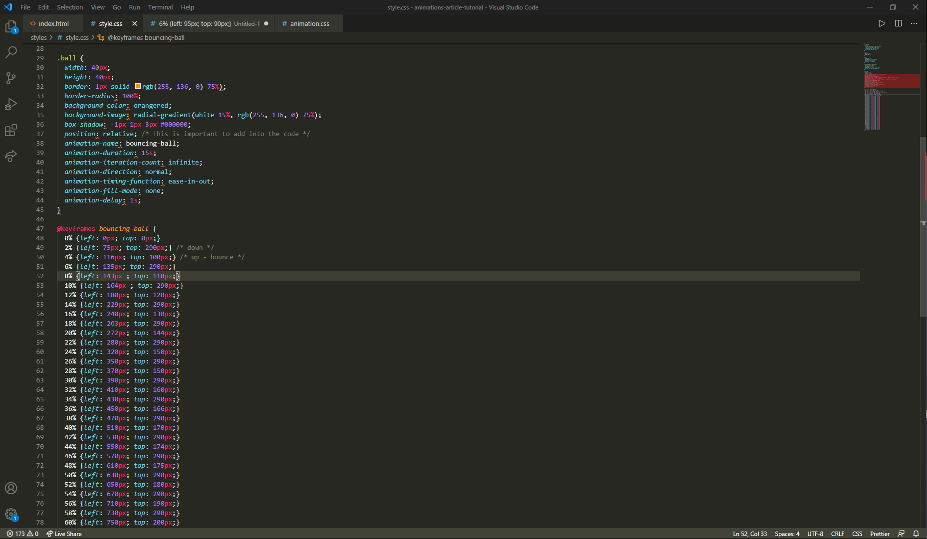
Fig. 1.9 The animation properties and values to use at lines 39–44
Alright, now you can view your work on the browser again and it should look a lot like the one in this video.
If your animation looks like the one in the video, great job! If it doesn't, don't worry….just go back to the top of this article & follow the same steps.
Feel free to change the values of the properties or even add more to the keyframes! There's so much more you can do with animations & it will make your websites a whole lot cooler than ever before! This simple animation is just the beginning of taking your websites to a whole new level.
If you want to see the files for this tutorial, you can find them here. If you need extra & simpler readings on CSS Animations, you can find it here on W3Schools which is what I found helpful for me. There is also an Animation Cheat Sheet provided here that might be helpful in your projects.
I hope that you have found this article useful & will even begin using animations in your projects as I did. Also, feel free to add any comments, etc that you have for my article. You can surely reach out to me on my LinkedIn, GitHub & Twitter. And please don't forget to share my article! Vinaka!
This article is also published on HackerNoon and Medium.


